Tuesday, December 14, 2010

Final 201 Presentation Boards: THE GREGORY'S SPACE


This is board 1/3 of my final presentation boards and this board contains both the Gregory's whole house including Dan and Patty's side, the mezzanine and also the grandparents little outfit as well as the concept statement which is derived from the poem "Home is Where the Heart Lives". I pulled from this key words that I thought were strong in the poem and then created a concept model from that. The concept statement explains this even further into detail (above).


This is board 2/3 of the final presentation boards. This board displays the two bedroom perspectives of the Gregory's bedroom, the two bath elevations, the materials for the bedroom and bathroom and the "concept" related photos to further explain the bedroom's ceiling and architecture.


This is board 3/3 of my final presentation boards. This includes the living/dining perspective with chosen materials, the living, kitchen and south entry perspectives and also the kitchen materials.

Chosen Materials for the Gregory Home


These are some of the sustainable materials and interior colors that were chossen to go in the Gregory's home. These materials and colors were chosen specifically to fit the Gregory's personalities, desires, needs, the Palouse and also chosen with consideration and appeal to the sustainability of them. These materials and colors will make for a great feel through out the house while providing aesthetically pleasing and long lasting materials as the Gregorys age.

Gregory Space Living/Dining Room Perspective


This is a perspective I drew of the Gregory's living/dining room along with some of the sustainable materials that were chosen. This beautiful design along with the colors, interiors and art that reperesent my design and also concept of the home representing a puzzle, one that you are able to "fit into".

Monday, November 8, 2010

Master Bathroom Concept Model


This is my concept model that was used throughout the Gregory residence and also the master bathroom. This concept model was developed and designed from a poem that talked about home and all of its elements. It's message said when you are at home you feel love, warmth, compassion and all your stress is relieved. You feel like you fit in and belong. A sense of calmness and content will contain you. This model therefore represents how we all go through life with our stresses and problems, but when we walk through the doors of our home, we feel a sense of belonging, we "fit in". The stress and worries are lifted off our shoulders, and we can relax. This is why I have all these shapes showing that they are penetrating through one surface and going onto another (us passing through our home's doors) These shapes fit perfectly through the spaces, just like us and our home's front doors.

Master Bathroom Space Model

This is what is called a white space study model. These are usually constructed out of white paper (bristol board) so that you are able to see the effect that shadows and light have on your space. This is also a great way to help yourself better understand the space that you have designed so that you have a clear understanding of how everything works together and also how much space you really have between things, something that is a misconception often.

Master Bathroom Process Packet

These are just a couple pages out of my process packet that I choose to show. Process work not only guides and helps you in the design process, but also shows your thought process and growth through out the design.

Master Bathroom Design Board 1/2


This is my master bathroom board that has my floor plan, my concept statement and parti sketch along with all the materials and finishes (lighting, plumbing, finishes etc).
This is my master bath board that contains my perspective of the bathroom, the west elevation and the small sketches that show features of the bathroom not otherwise seen.

Friday, November 5, 2010

Wheelchair Experience- Stepping Inside Accessible Design- Pictures

Below are some of the photos taken of me while in the wheelchair encountering some of the accessibility issues around the WSU campus...

This is me when I reached the bathroom in the library building.
It was hard to enter this room because of the door being pressurized, I wasn't able to roll in and hold the door open at the same time. The bathroom and the stall were accessible otherwise.


This is me at the espresso bar right outside of the bathroom. As you can see I may be able to reach the counter, but am un-able to see over it. This could prevent me from signing receipts and writing checks.


This is me back in the first building that we started in and I am making my way to the elevator which is on my left. The access in this door was almost too small because of the door frame that was required to make it a wheelchair accessible door. Oh the irony of that!


And lastly, I tried using yet another bathroom in the building and in this one I was unbale to get past the doorway because of a garbage can that was not thoughtfully placed. You have got to take into account ergonomics when designing a space.


Wheelchair Experience- Stepping Inside Accessible Design-About the Experience

For the wheelchair experience that we were asked to partake in another student and I were able to see how much accessibility should be taken into account and to what extent when designing a space. We also learned how much accessibility is over looked when designing a space. In the experience we were to figure out how to get down and out of a building that only had one way out (not clearly or conveniently clear to someone visiting). We then were to make our way over to another building next door, enter the library, fit down the isles (almost not enough room), find a book (not easy to reach), make a copy at the copier (too tall and awkward to reach), leave the library and use an accessible bathroom, order a coffee at the espresso bar and lastly go back up the first building and use a bathroom in it (way to small).

This experience not only gave me personal experience and insight to accessibility and universal design, but also really made me more aware now when working with dimensions of spaces and materials.


Sunday, October 24, 2010

Kitchen Design Board 1/2


This is my Gregory's Kitchen design that was designed based off of the concept model of the puzzle piece. This was basically a rough mock up of what the kitchen design board would contain with perspectives, materials of the kitchen, elevations, 3 sketches of architectural features, concept statement and the over all layout of the whole Gregory residence. This is what interior designers like to call a loose mock up which allows for change, revision and creativeness.

Child's Room Space Study Model


This is my white board space study model for my child's room that allows for development and a better space study of the design. Underneath the loft there is about a 6 foot by 10 foot space all for the twin boys to play and store their things. By constructing a small space study model in 1/4th inch scale you are able to see and experience the space much more effectively and make better decisions for the over all design.

Child's Room Concept Model

This is my child's room concept model that I developed off of another set of parti sketches. We were to develop a parti based off of a child's book and then from the parti sketch, develop a concept model. This time around, the thought process involved coming up with a parti sketch that was successful in explaining my concept statement was much easier for me. I learned that with time and experience you begin to think abstractly and you truly do become much better at it. The concept statement was how we all go through life and take what we learn from the good and the bad experience and apply them to the new good and bad experiences that come along. everything in this model is moving and growing. The ribbon represents "life" and the structure has 3 squares to it stacked on top of each other that are all bigger as they get higher.

Child's Room Board 1/2

These are my child's room design concept boards. They are my first design concept boards this year and they are very rough. I take this as a learning process and try to lean and grow so that I am able to make even better design boards in the future. Process involved with making these boards involves thought and skill. You have to have a creative mind to try and make your boards connect to your concept. Everything that is on your board, the colors the lay out, the design, the shape ultimately everything has to connect back to your concept. You also have to pay attention and give thought as to how you are going to present your design successfully so that the clients know what exactly you are thinking. This involves communication skills and also drawing, perspective and rendering skills.


Concept Development 3D Model


This is the 3D concept model that I produced from the concept parti. This represents "home" and how we all have hectic, busy and stressful lives outside of the home (hence the floating shapes). When we walk into our homes, we automatically feel at home, safe, comforted, and loved. Its like we are the puzzle piece to a puzzle. we fit in "like a puzzle piece" This is why I have this model showing all this shapes going into places they fit in perfectly.

Concept Development Parti Sketch 2D


This is an image of just one of the concept partis that I developed while trying to come up with a good abstract figure to represent my concept about home and fitting in. The successful part about this was that after all the time spent with exploring different ideas with partis, I was able to come to a good stop with this one. I feel that it best describes and represents my concept statement. The process involved with this was lengthy, but it was all worth it in the end. It takes time and allowing your brain to explore to come up with a good working concept. A weakness about this process was that it took me a while to develop this, being that I hadn't been used to this way of thinking. As I practice more with opening my mind and allowing my mind to explore and think abstractly, this becomes much easier. I feel a strength in this process was that my parti turned into an excellent 3-D model that then was a fun concept to design the Gregory's house from.

Wednesday, April 28, 2010

Process Poster-3D Room Project

This is my process poster for my 3D room design project that we did this
Spring in ID 102. We were to gather all of our process work through out the projects process and then come up with a way to accuratly and nicely place them on a 20x32 poster created in indesign. This project was set in place to help us develop skills in organization and accurate presentation skills so that w are able to get our design concepts and ideas across to the client in a professional and orderly way. This is crucial in the design industry. Through out this process I again was developing more and more of my design skills skills and also my skills with in adobe indesign.
I am going to be using this program allot through out my career and it is important that I know how to get around on it.

Saturday, April 17, 2010

Designer's Resume

This is my designer's resume that I created in In-Design. I found this to be very beneficial, for it makes for an over all good and aesthetically pleasing and interesting resume, one that might be looked at over another. Since I am in a design field where competition and who you know is everything, I wanted something that would scream "look at me" while still staying true to the professional look.

Wednesday, April 7, 2010

Logo 3


Just another Logo :) Im thinking I like this one and my first one the best, still a work in progress. I do want to still keep the unique lines that make up my initials.

Logo 2

Heres another logo that I came up with. A little more to it, but still simple and more importantly it represents me!

Designer's logo


This is my designer logo that i have created and it is indeed a work in progress. I was supposed to experiment around with adobe illustrator and see what all I am able to do with the tools and what not. This design is not at all by means anything too hard or fancy, but I kind of like that. I like the more sophisticated look because I feel that it represents me as a designer the most. I feel that through this process I was able to get a first look and introduction to adobe illustrator which I feel will benefit me in my career.

Monday, March 29, 2010

German Textile Design


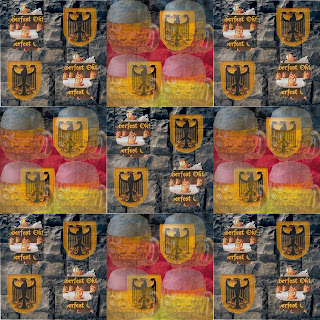
This is my German textile that I designed. For this project we were to research our families heritage and then come up with a design using multiple elements such as pictures to represent it to the fullest. My families heritage is mostly German so I decided to take some pictures such as beer, Oktoberfest banners and castle stone and brought them together to create an over all well constructed textile. I believe that through this project, my photoshop skills did become stronger and more developed being that I had to work with layers and distortion of images. I really believe that i did a good Job bringing two images modules together (beer mug and Oktoberfest) and incorporating the German crest into the background so that the eye flows evenly from one module to another, much like you would have to do in a house. The rooms should somewhat flow together.

The following is the Designer's concept statement that I wrote for this.

Concept Statement

The German heritage along with its traditions and cultural customs and beliefs is very much practiced, appreciated and honored through out both sides of my family. I am almost all German with just a little Swedish in me and I have taken it upon myself to research a bit about the German culture. I love everything about the German heritage and Germany it self, the activities, scenery and of course the history are so amazing! Germans have very active life styles and personalities. We love to engage in get to-gethers and hold social events with lively music and games. The festivities, food and traditions, like the Oktoberfest and summer and winter solstice are just a few of the festivities that many people from all around the world travel to Germany to take part in.

In my block, you see that I have used the traditional German hawk crest, the famous castle stone from the castle of Neuschwanstein, beer mugs, the German flag and lastly, the famous title and ever changing logo of Oktoberfest. I feel that all of these parts in my block summarize and make up a good representation of my German heritage. I love parties and socializing with friends and family and believe in having a good time, which coincidently the beer mugs and Oktoberfest banner represent. I also love to travel and learn about the history of new places which I believe the flag, stone and hawk represent.

In developing ideas, concepts and the block itself, you have to think about how you can develop a pattern that represents yourself within the culture. You then start to play around with what ideas and patterns you want to show up more and what ones you want to show up less. Keeping this in mind will help you develop a solid patterned block.

Sketch 3

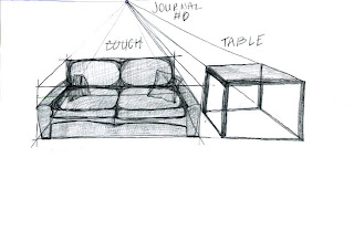
This is a sketch of furniture that I drew using the one point perspective box. In design it is said that you are able to draw everything in a box and this will help you as a growing designer to master the tool of quick sketching while still staying within the perspective. I think that I have a good grasp on drawing with the box.

Sketch 2


This is another sketch that I did again playing with one point perspective and having the vanishing point in a different place. Instead of having the vanishing point right in the middle of the paper I placed it to the left. I think that I did a good job showing the over all shape and type of entertainment center and all its features. I also think that the accessories again open the client to see all the possibilities that you have as far as decorating goes. I love this sketch!

Sketch 1

This is one of my first sketches that I did using my one point perspective. Since I didn't know much about one point perspective at the beginning, I now notice things that I did wrong having now a good grasp on one point perspective. For example, the side tables that sit next to the sofa are not drawn using this perspective. The left one should in fact be turned the other way looking like right one where it points towards the couch. The direction of all your furnature in a room depend upon where that one vanishing point is. You can ALWAYS connect everything back to a vanishing point. I do however think that I have a good use of accessories in this sketch, showing the room potential for accesorie placement.

Friday, March 26, 2010

Summer's Wave

This is my pattern assignment where we were supposed to take images and distort them so that you are unable to recognize what they originally were. While distorting images and putting them into a pattern of choice, you were also to try and keep a good composition and even flow through out the pattern. This assignment was hard in the sense that you had to figure out a way to find pictures and images that were all of relevance to each other and then figure how to make them flow nicely while they were distorted and such. I think that I did a really good job picking out pictures that were all of relevance and also pictures that had inspiring colors and shapes. I learned that it takes time and patients to make something look aesthetically pleasing and flow well.